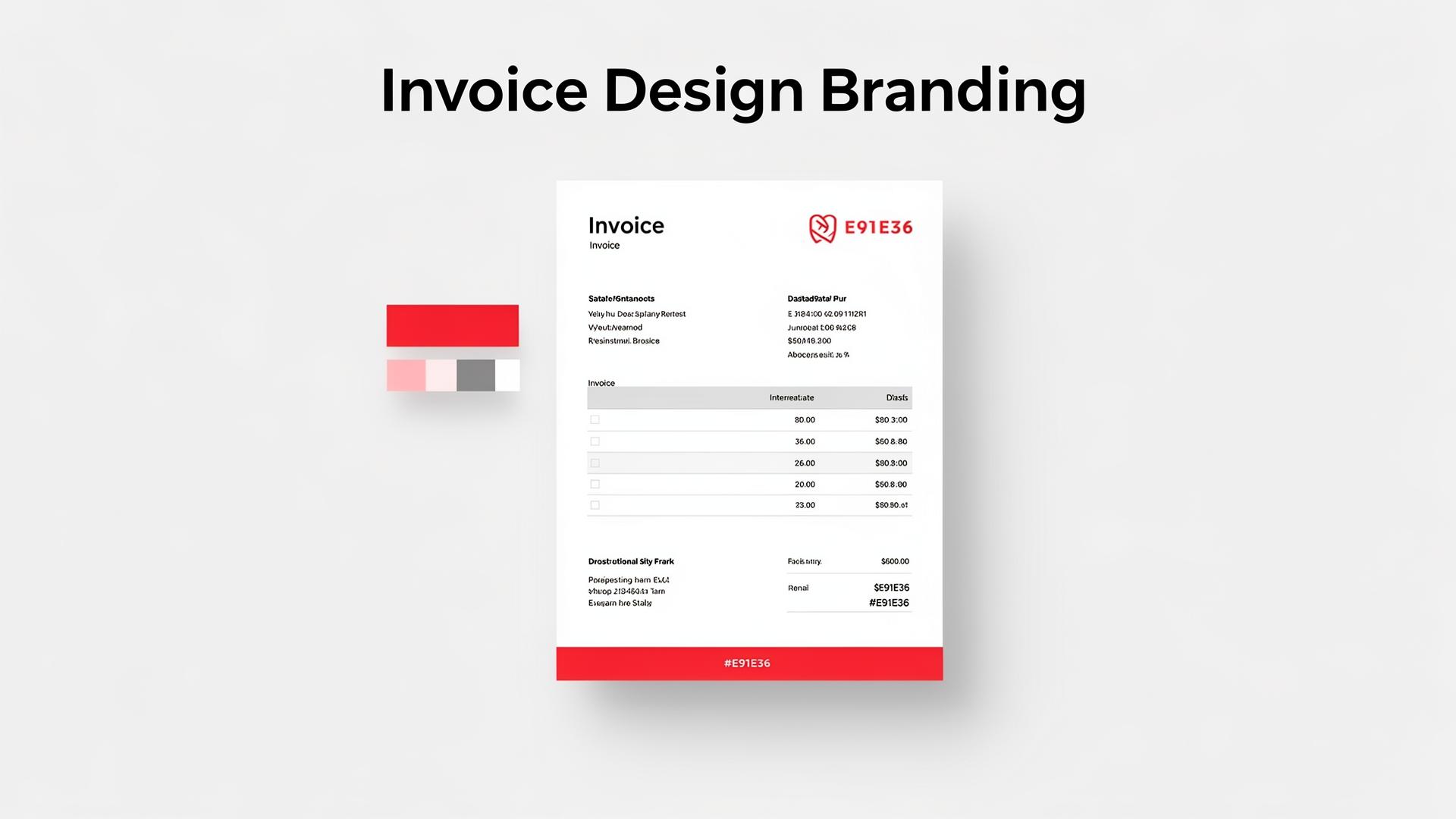
Invoice Design: Professional Branding Tips That Get You Paid
Invoicing Mastery Series
This guide is part of a comprehensive series. Explore all 33 topics:
Your invoice is more than a payment request—it's a brand touchpoint. Every time a client opens your invoice, they form an impression of your business. A well-designed invoice signals professionalism, builds trust, and actually helps you get paid faster.
Research shows that branded, well-designed invoices get paid up to 3 days faster than generic ones. This guide teaches you how to create invoices that strengthen your brand while remaining clear and functional.
Why Invoice Design Matters
Consider the client's experience: they've received your service, they're satisfied, and now they see your invoice. A polished invoice reinforces the quality of your work.
Consider the client's experience: they've received your service, they're satisfied, and now they see your invoice. A polished invoice reinforces the quality of your work. A sloppy one creates doubt—even subconsciously.
- First impressions: For new clients, your invoice may be the first "official" document they see
- Professionalism: Clean design signals a serious, established business
- Clarity: Good design makes it easier to understand charges, reducing disputes
- Brand recognition: Consistent branding across all touchpoints strengthens your identity
Essential Design Elements
Logo and Brand Identity
Place your logo prominently—typically top-left or top-centre. Use your brand's colour palette throughout the invoice. Consistent typography matters: stick to 1–2 fonts maximum.
- Use a high-resolution logo (at least 300 DPI for print, 150 DPI for digital)
- Maintain consistent spacing around your logo
- Match colours exactly to your brand guidelines
Typography
Choose fonts that are professional and readable. Sans-serif fonts like Helvetica, Open Sans, or your brand font work best for invoices. Use font weight and size to create hierarchy:
- Headers: 14–18pt, bold
- Body text: 10–12pt, regular
- Total amount: 16–24pt, bold—make it impossible to miss
Colour Strategy
Use colour purposefully:
- Primary brand colour: Headers, logo area, key accents
- Dark text: All body content for readability
- Accent colour: Total due, payment button, key call-to-action
- Neutral backgrounds: White or very light grey for the content area
Avoid using too many colours—2–3 is ideal. The goal is to look professional, not festive.
Layout and White Space
Cluttered invoices confuse clients. Use generous margins and spacing between sections. Key layout principles:
- Clear visual hierarchy from top to bottom
- Logical grouping of related information
- Adequate spacing between line items
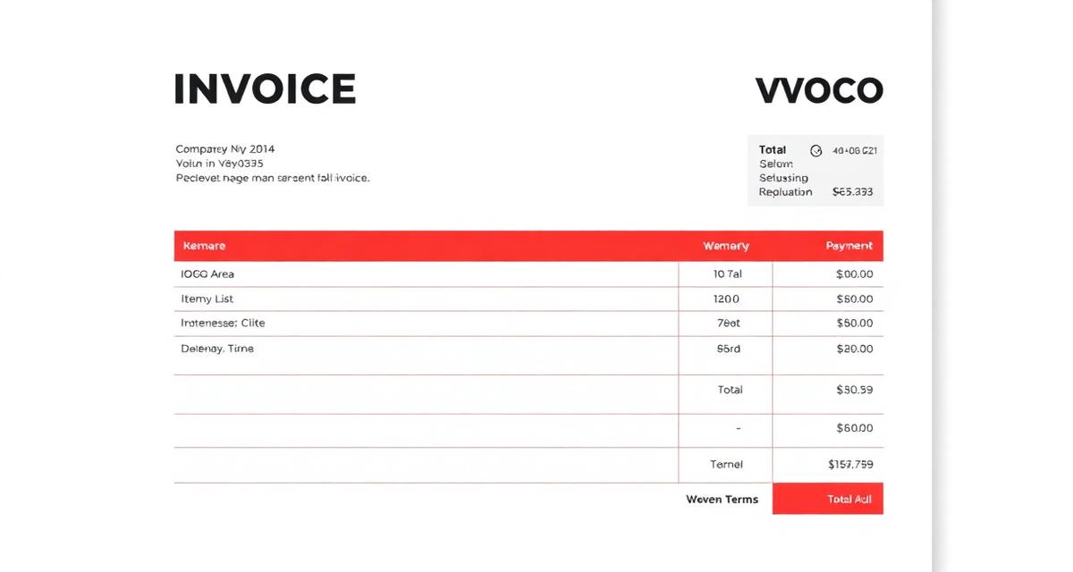
- The total amount should stand out visually
- Payment instructions should be easy to find
Anatomy of a Well-Designed Invoice
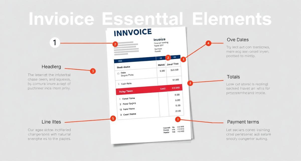
Follow this layout structure for maximum clarity:
Follow this layout structure for maximum clarity:
- Header zone: Your logo, business name, and "INVOICE" label
- Info zone: Invoice number, date, due date + client details
- Line items zone: Table with descriptions, quantities, prices
- Totals zone: Subtotal, taxes, discounts, total due (make it prominent)
- Payment zone: Clear payment instructions, bank details, or payment link
- Footer: Thank you note, terms, contact information
For the complete list of required elements, see our guide on essential invoice elements.
Branding Dos and Don'ts
Do:
Use your brand colours consistently Include your logo on every invoice
- Use your brand colours consistently
- Include your logo on every invoice
- Add a professional thank-you message
- Ensure the total amount is the most visually prominent number
- Use the same design across all invoices for recognition
Don't:
- Use clip art or low-resolution images
- Overcrowd the layout with unnecessary graphics
- Use more than 2–3 fonts
- Hide the total amount or payment instructions
- Use different designs for different clients (consistency builds trust)
Digital vs Print Design Considerations
If you send digital invoices, consider how they look on screens:
If you send digital invoices, consider how they look on screens:
- Test readability on mobile devices—many clients review invoices on phones
- Use clickable payment links and email addresses
- Ensure colours display correctly on different screens
- Keep file sizes reasonable (under 2MB for email attachments)
Using Invoice Templates
Starting from scratch is unnecessary. Professional invoice templates save time and ensure consistency.
Starting from scratch is unnecessary. Professional invoice templates save time and ensure consistency. The best templates let you:
- Upload your logo and brand colours once
- Auto-populate client and business information
- Maintain consistent formatting across all invoices
- Generate professional PDFs automatically
Invoicemonk provides customisable templates that adapt to your brand identity while ensuring all compliance requirements are met.
Related Resources
- Complete Guide to Business Invoicing
- How to Create a Perfect Invoice Template
- Digital vs Paper Invoices
- Essential Invoice Elements
More in this series (33 articles)
From this series
Master the art of professional invoicing to get paid faster and look more professional.
Related Topics
Digital Marketing, SEO Specialist, Content Creator & Product Professional
Olayinka is a digital marketer, content creator, growth and SEO specialist with 10+ years helping businesses in Nigeria, the UK, the US, Australia, and Dubai achieve their goals online.